Dark Side: Our history with the black Away and Third Kit
Thu 26 June 2025, 16:40|
Tottenham Hotspur
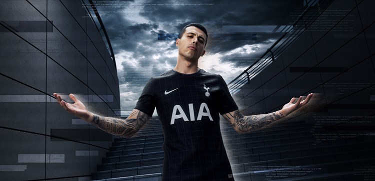
In bold contrast to our iconic Lilywhite home shirt, the launch of our all-black 2025/26 Nike Away Kit signalled a highly-anticipated return to the darker side which has been a popular alternative for Spurs supporters over the years.
On Thursday morning, 26 June, we revealed our brand new away strip for the upcoming campaign - a dramatic, black look forming a razor-sharp silhouette fit, engineered for speed and built for stealth. Unveiled with the tagline “In Darkness We Dare”, a twist on our renowned motto, the bold look also marks our return to UEFA Champions League away nights for the forthcoming season.
Black was first used on a Spurs shirt in the nineteenth-century, a white-and-black-striped change shirt to avoid a kit clash in 1899, but was largely shelved on a playing shirt until it's revival in the 2008/09 season to devastating effect.
Since then, black kits have proven ever-popular amongst our fanbase and this latest design is no different, so let's delve a little deeper into our sartorial history to uncover a fascinating and stylish flirtation with our dark side (excluding goalkeeper kits).
2008/09 Away Kit
The first triple black change kit of its kind and a thing of beauty. This shirt was a Puma King-inspired shirt which combined black with gold trim, a v-neck collar and twin Puma King stripes on the right shoulder.
It was worn five times, including one European outing against Wisla Krakow in the 2008 UEFA Cup, and was quickly sold out as the love affair with black kits began.
2011/12 Third Kit
This third strip featured a gold diagonal Puma King motif, white diagonal line on the right shoulder, gold detail on the shorts and white and gold hoops on the socks.
With a title sponsor combination of Aurasma in the Premier League and Investec in the cups, this kit debuted in a pre-season friendly at Brighton & Hove Albion in July, 2011 before its first competitive outing came in a 2-1 away league win against Blackburn Rovers in October.
2012/13 Third Kit
Admittedly, it's not all black, but it still counts as another staple darker option in the collection. As our six-year partnership with Puma ended at the end of the 2011/12 campaign, Under Armour came in as our new kit supplier as we became the American company's first football club.
In an eye-catching black and grey halves combination with a yellow trim, the ambitious design with its crew-neck collar was worn seven times in the league and once in the cup.
Did you know? On the long-sleeved version, the crest is visibly lower than on the short-sleeved edition. This was in response to a request from Gareth Bale (pictured) and, with it, players started to favour wearing the longer sleeves.
2014/15 Away Kit
In a smart tribute to the late, great Bill Nicholson, this black away kit featured a distinctive yellow pattern as a nod to the shade of yellow that was introduced as an alternative kit colour during Nicholson's tenure in 1958 and its 11 stripes represent our former manager's trophy haul.
First worn against Chicago Fire on pre-season tour in the United States in 2014, the shirt was then worn away to Manchester City, Swansea City and Queens Park Rangers.
2021/22 Away Kit
The best-selling away shirt for a reason! On the theme of the article, it's not as tenuous as it might look at first glance as this away jersey is predominantly black with the iconic psychedelic, cosmic pattern on top - simply out of this world!
To comply with Premier League and UEFA regulations, the neon yellow names and numbers were printed on a plain black panel on the back of the match shirt and was complemented by black shorts and socks.


